Ola Bites
Packaging Design / Illustration / Brand Identity
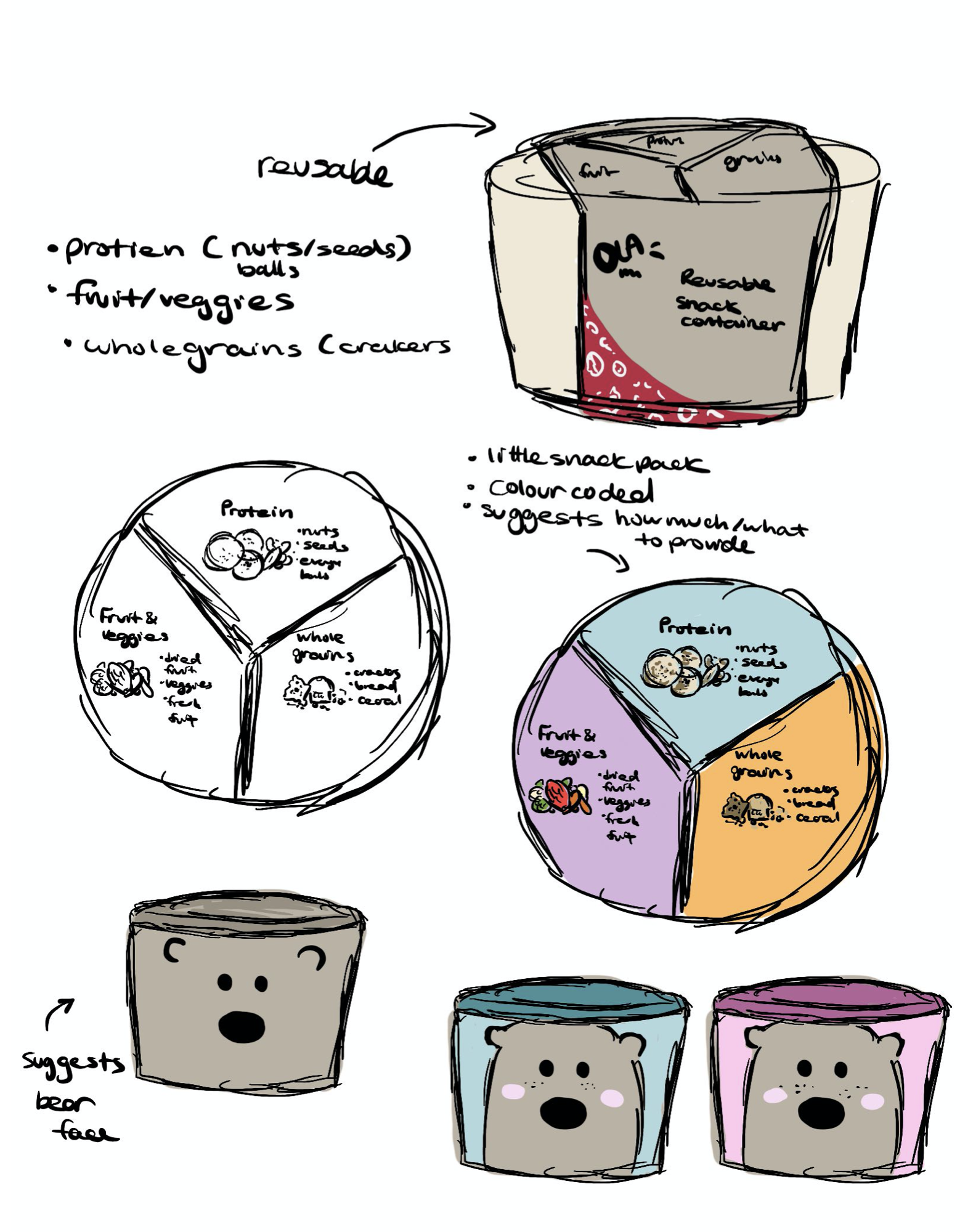
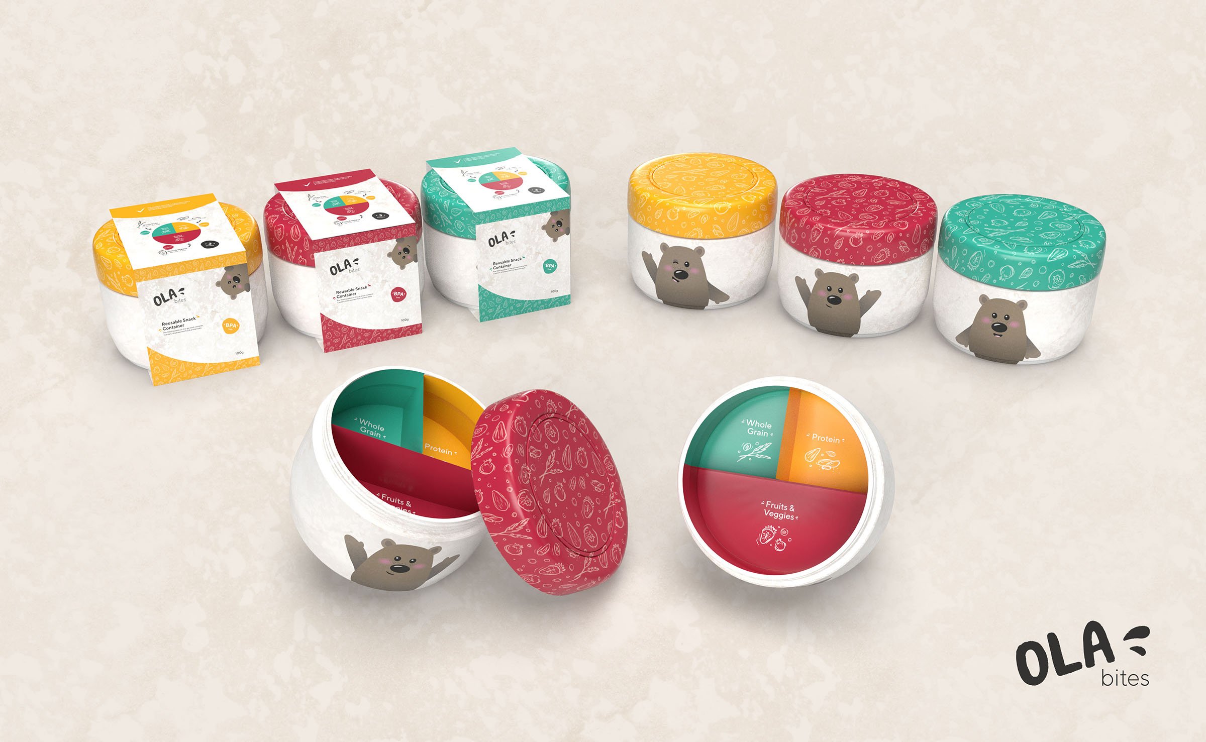
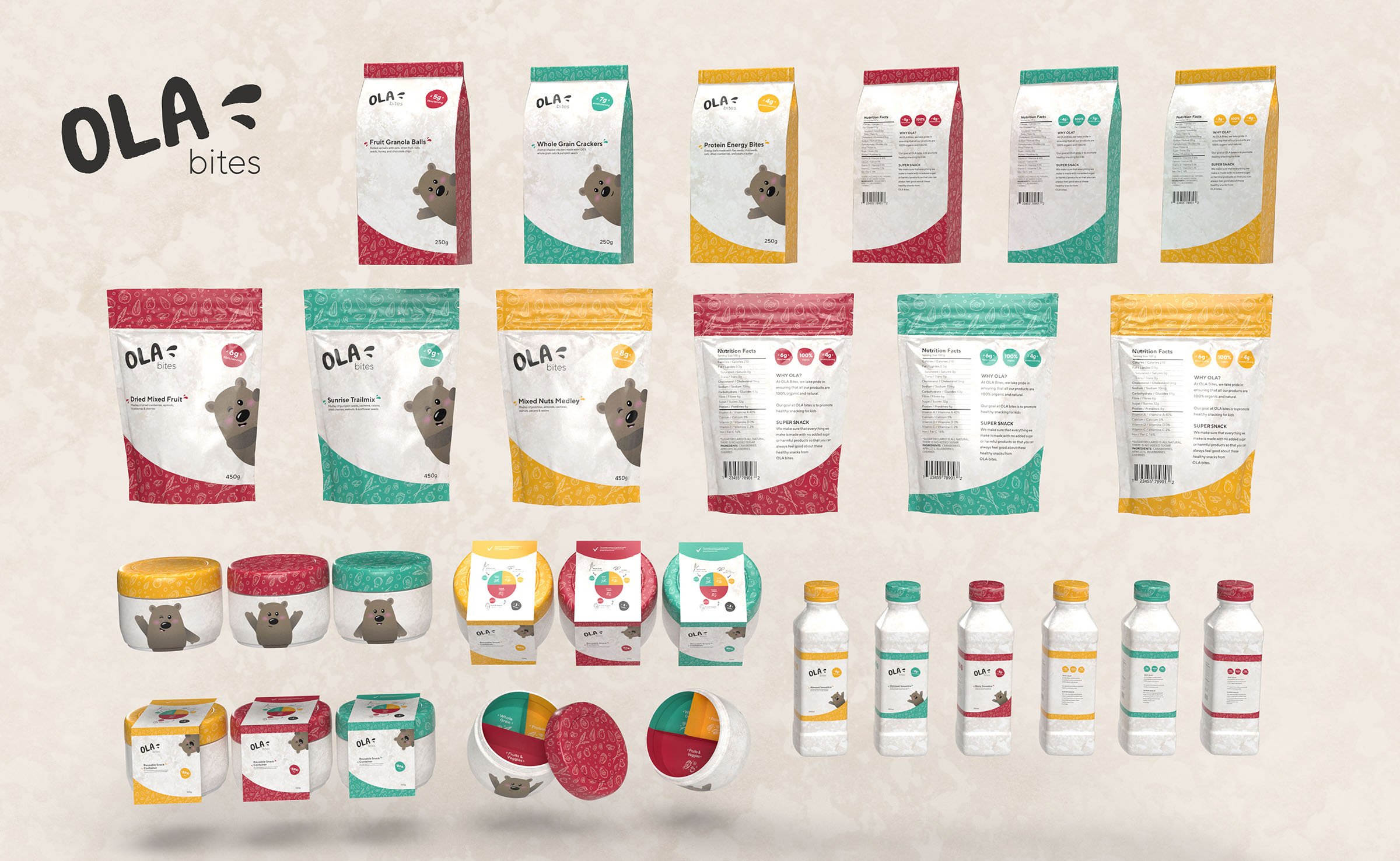
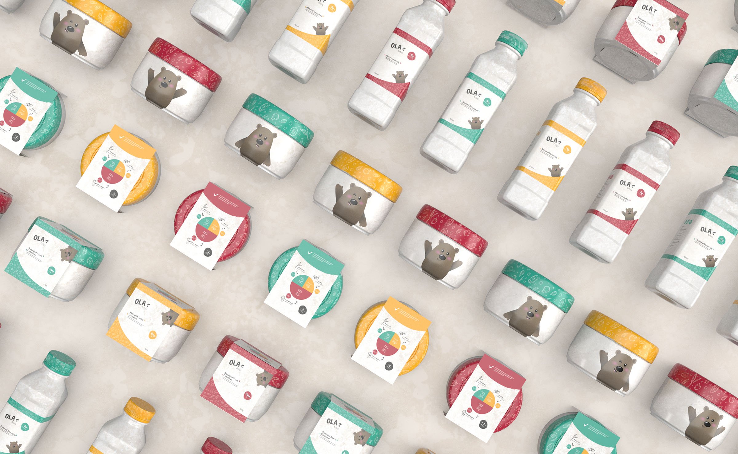
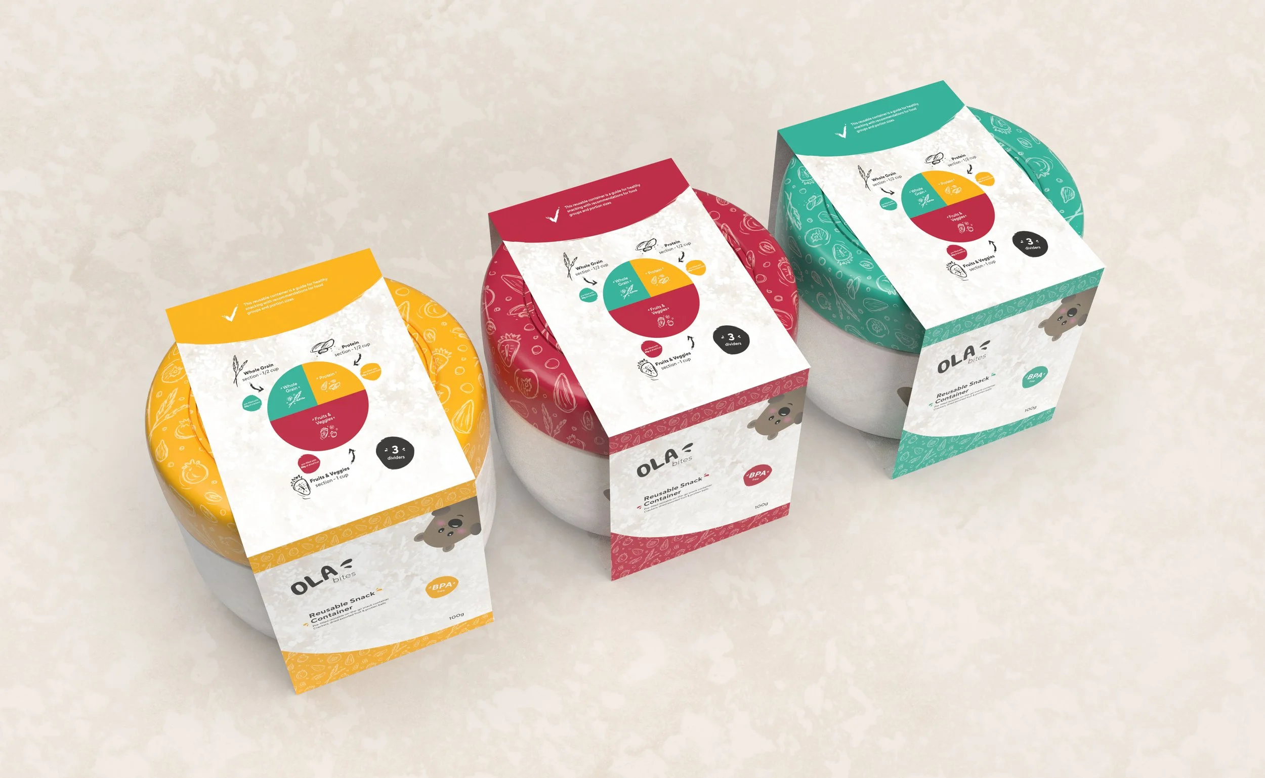
Ola bites is a healthy, nutritious, organic, on-the-go snack brand for kids. The word “ola” means heath, life, and well-being in Hawaiian, which is why the name was chosen for this brand. The goal of Ola bites is to promote healthy snacking for kids by providing a healthy, organic option that is also delicious & fun. They also promote portion control with a reusable snack container, which has food group recommendations & dividers.
-
Tools Used
Illustrator, Dimention, Photoshop
-
Year
2021
-
Purpose
School Project - Conestoga College (Studio VI)
Problems to Solve
Sometimes parents reward good behaviour with treats or junk food, which can imply that sweets are better than other foods..
Rewarding kids with candy and sweets can start a pattern of unhealthy eating habits.
Some people tend to eat what’s in from of them and not have much portion control - They might not realize how much they have eaten.
They might eat more than was expected, and could be consuming several times the amount of sugar, fat, sodium etc. that they intended.

Goals
Promote healthy snacking for kids by providing a healthy, organic option that is also delicious and fun.
Offer a fun, tasty and healthy way for kids to enjoy on-the-go snacks and promote healthy snacking.
Create an appealing visual representation and packaging design for a healthy snack brand that would appeal to kids.
Encourage kids to participate in healthy snacking and to not overeat, but eat in smaller portion sizes appropriate to the type of snack.
Solution
This healthy snacking brand serves as a way for kids to enjoy eating snacks because they are delicious AND healthy.
The brand helps control portion sizes and avoids overeating by offering customers the option to purchase a reusable snack container that suggests appropriate serving sizes. This will help them not overeat but know the approximate amount of snacks that are healthy.
A reusable cup comes pre-filled with healthy snacks. This offers a reusable solution and still offers convenience.
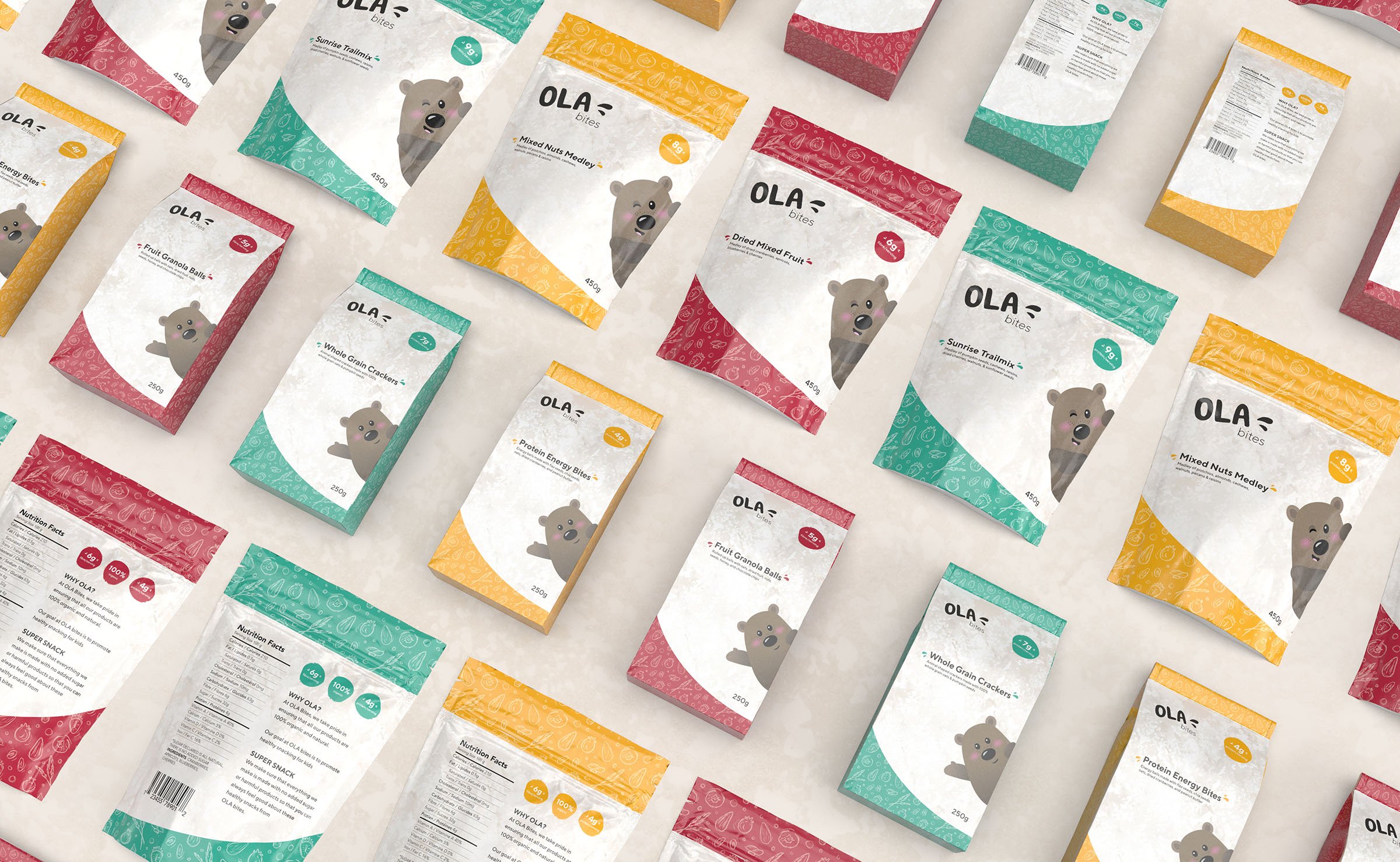
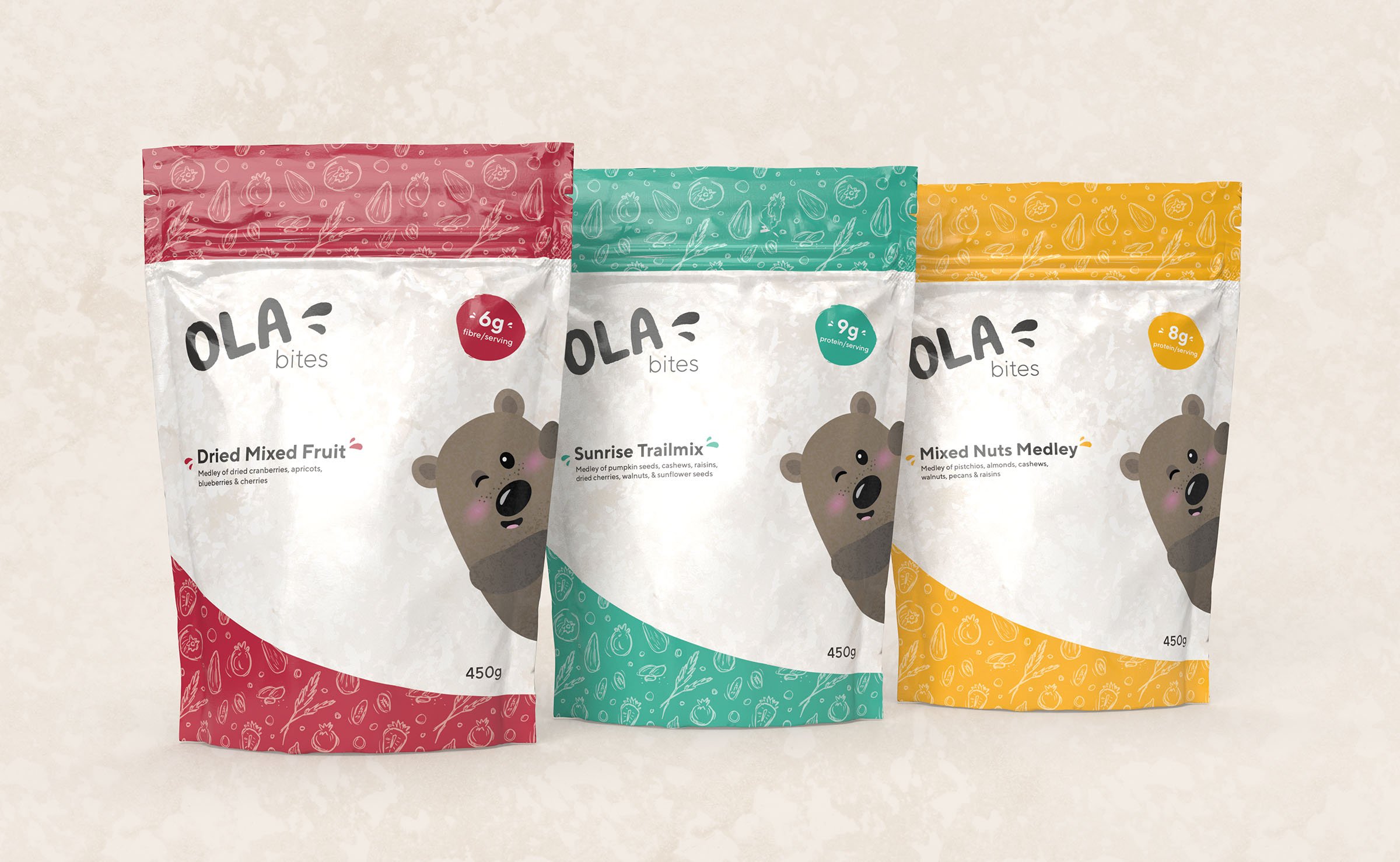
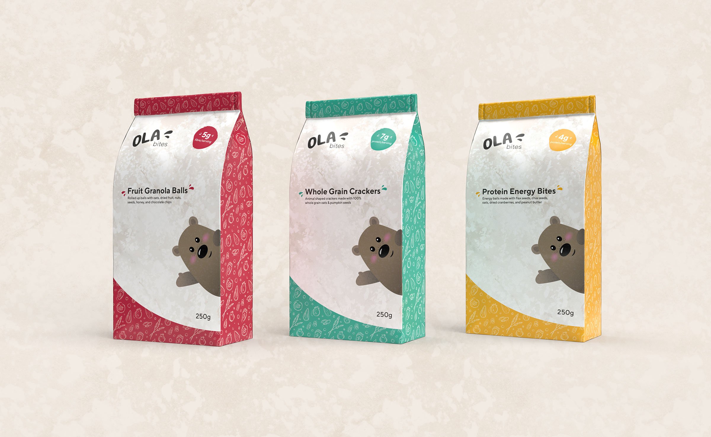
The brand sells various snacks like nuts, dried fruit, trail mix, protein balls, and crackers.

Strategy
A pre-filled, reusable snack container with dividers was designed to act as a guide for snacking as it provides recommendations for food groups and portions sizes.
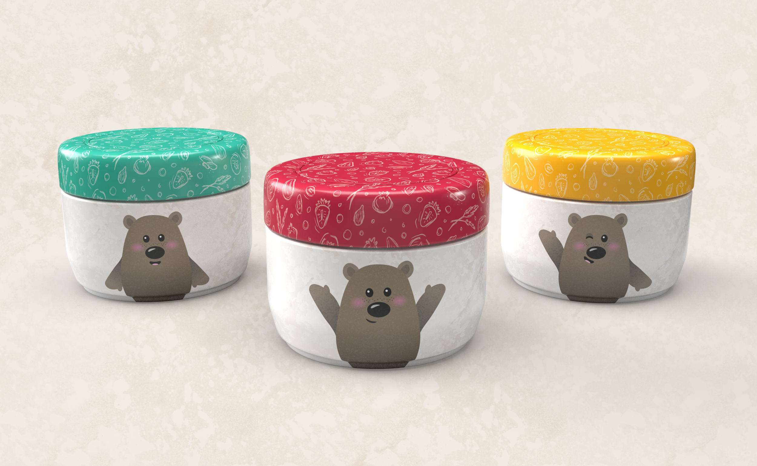
The logo and packaging designs have an organic-looking appearance (with rough, textured elements) to suggest these snacks are healthy & organic.
The packaging exhibits a fun, happy, cute, playful, inviting and friendly-looking style to appeal to kids.
Process Work
-
![]()
Ideation
-
![]()
Logo Brainstorming
-
![]()
Initial Packaging Brainstorming
-
![]()
Packaging Thumbnails
-
![]()
Packaging Thumbnails
-
![]()
Packaging Thumbnails
-
![]()
Packaging Ideation
-
![]()
Packaging Brainstorming
-
![]()
Thumbnails
-
![]()
Packaging Linears
-
![]()
Thumbnails Sketches
-
![]()
Graphic Toolbox
-
![]()
Graphic Toolbox
-
![]()
Graphic Toolbox