
Legendairy Ice Cream Branding
Brand Identity / Illustration / Logo Design
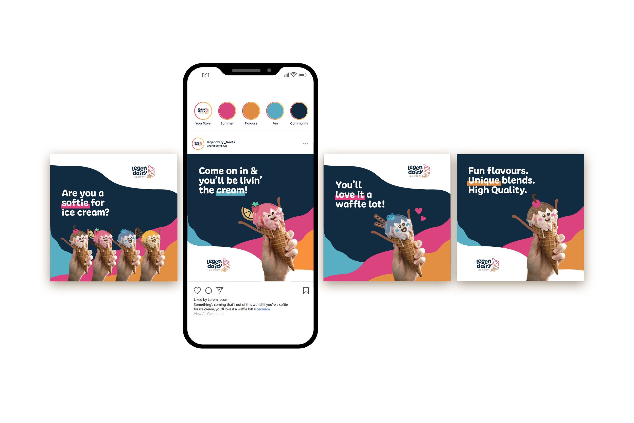
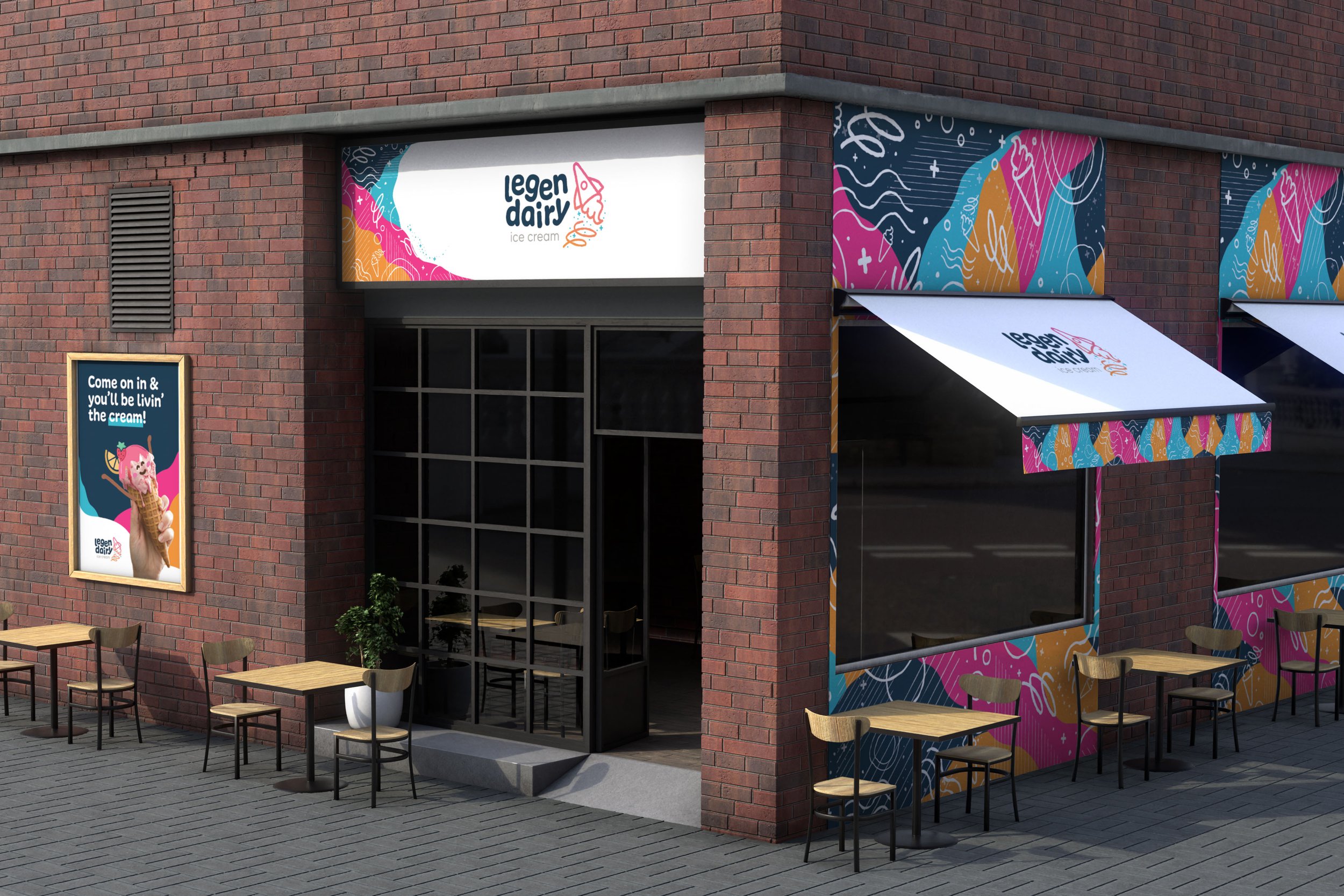
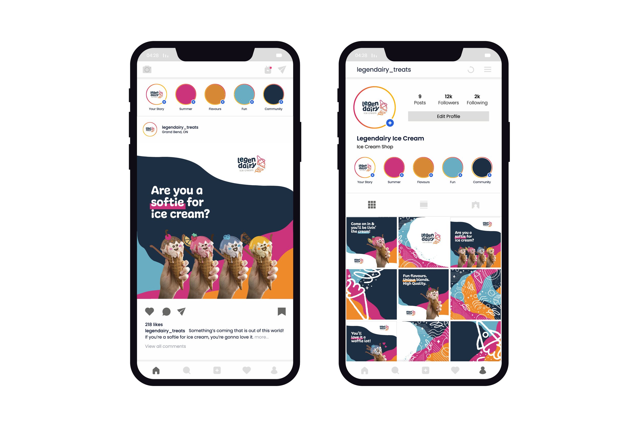
Legendairy Ice Cream is a fictitious ice cream shop. It features bright, exciting colours and fun designs. This unique local shop intrigues others to come to buy the products with its unique take on playful and witty design. The purpose is to provide people with a fun, and exciting ice cream experience that they’ve never experienced before.
*Received RGD Student Awards Honourable Mention - Brand Design (September 2022)
-
Tools Used
Illustrator, Photoshop, Dimension, InDesign
-
Year
2022
-
Purpose
School Project - Conestoga College (Studio VII)


Company Mission
The company's mission is to create unique and high-quality handmade ice cream flavours with a twist, and that set it apart from the crowd. The brand aims to make customers smile and laugh by creating a fun, friendly and witty environment.

Company Vision
The company's vision is to be known as the “fun ice cream shop” and to be the place people come to enjoy fun, high-quality, delicious ice cream with friends and family.
Goals
The goal is to intrigue people to come to buy the products, and for the shop to pop and stand out. The goal is for customers to be drawn in by the fun design and for the branding to accurately reflect the shop’s brand personality - witty, fun, quirky and playful.

Values
Playfulness
Creativity
Create a friendly, fun environment
Customer Focused
Quality
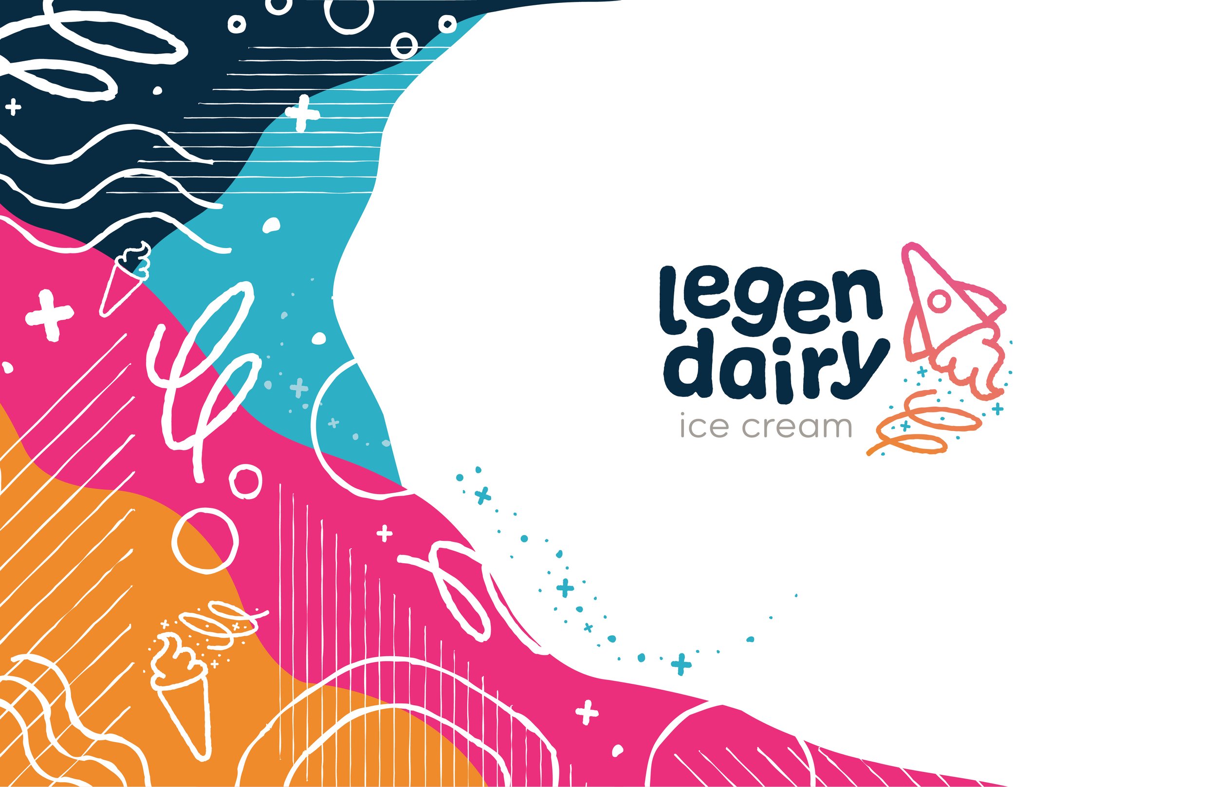

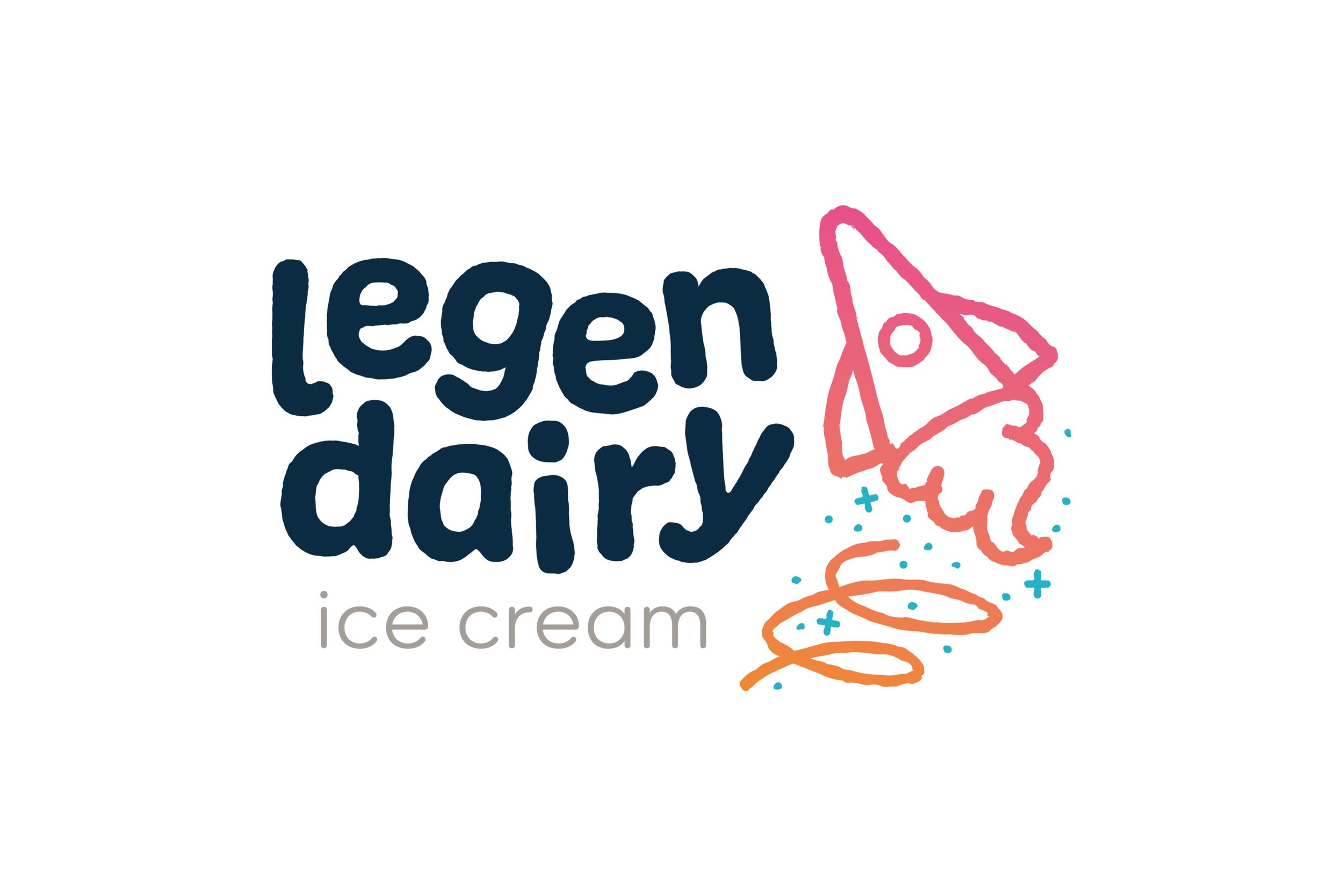
Logo Explanation
Rocket ship: Can also be seen as an upside down ice cream cone, which implies that the brand is creative, unique, fun, quirky, clever and playful. It also suggests that it will be an out of this world experience.
This creative interpretation implies that the flavours they sell is like nothing people have seen before.
Texture: Suggests authenticity, natural, and handmade quality
Swirl: Symbolizes unique flavour combinations
Stars: Represents sprinkles and an overall fun & playful atmosphere
Rounded lettering: Friendly and inviting
Lowercase type: Casual, approachable, playful
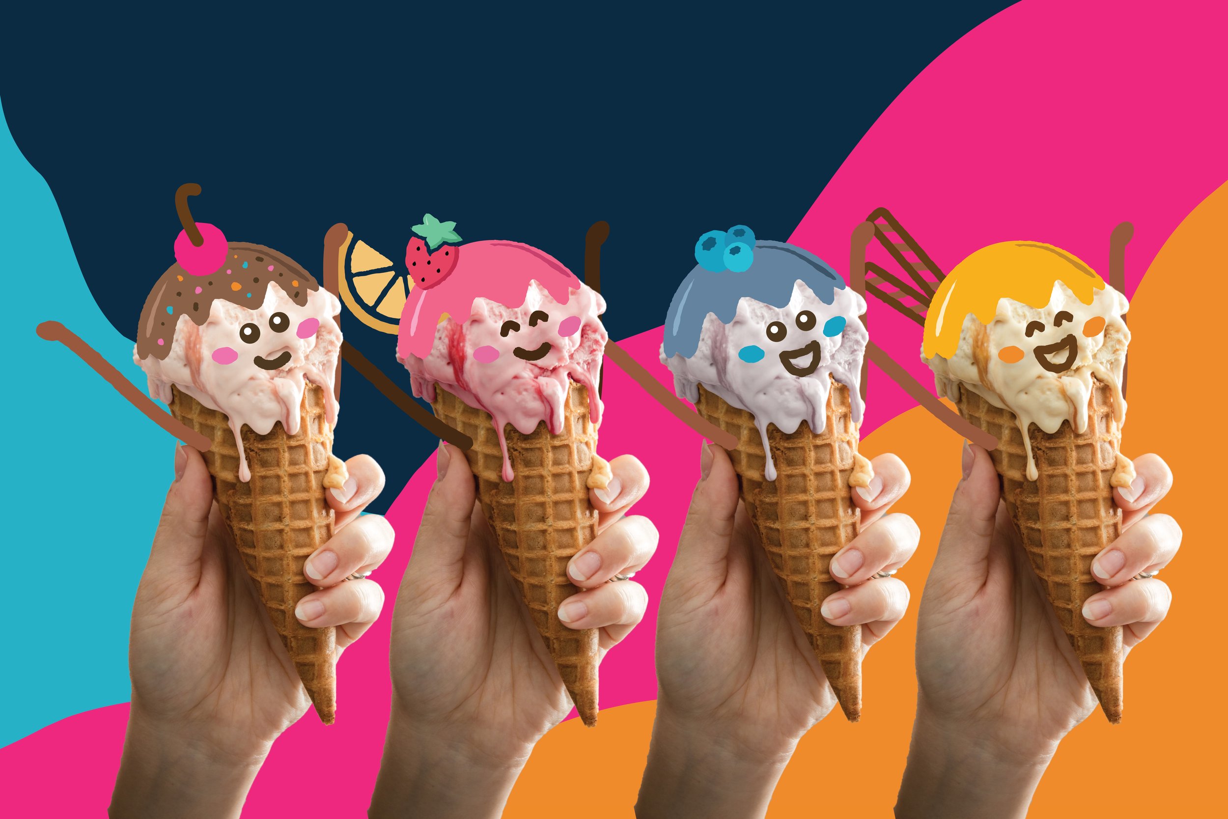
Brand Colours
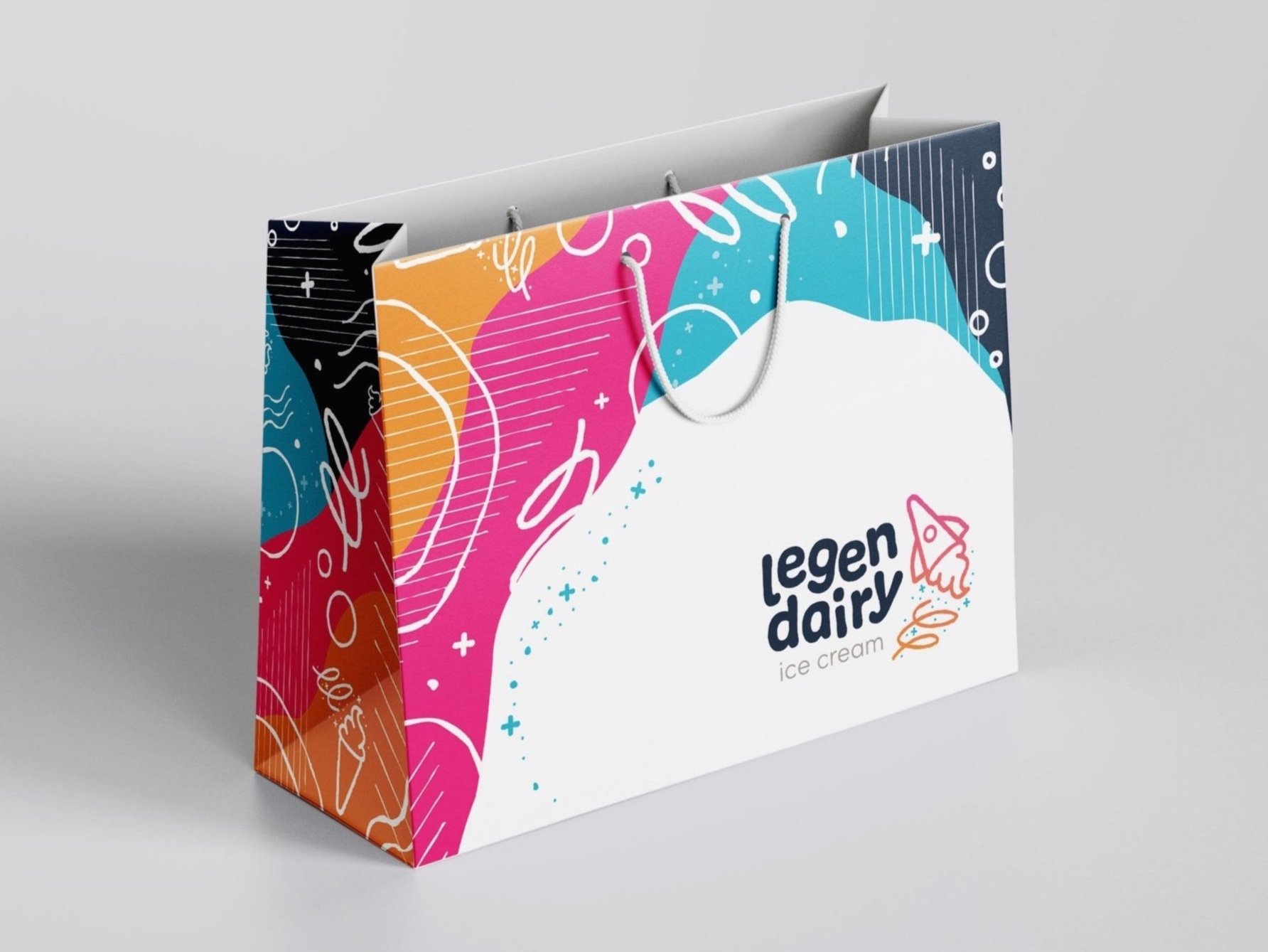
The bright, modern, fun and playful colour palette was inspired by vibrant and fun summer days and the many bright colours of the solar system. This blend of colours creates an attractive, energetic, exciting and playful energy.

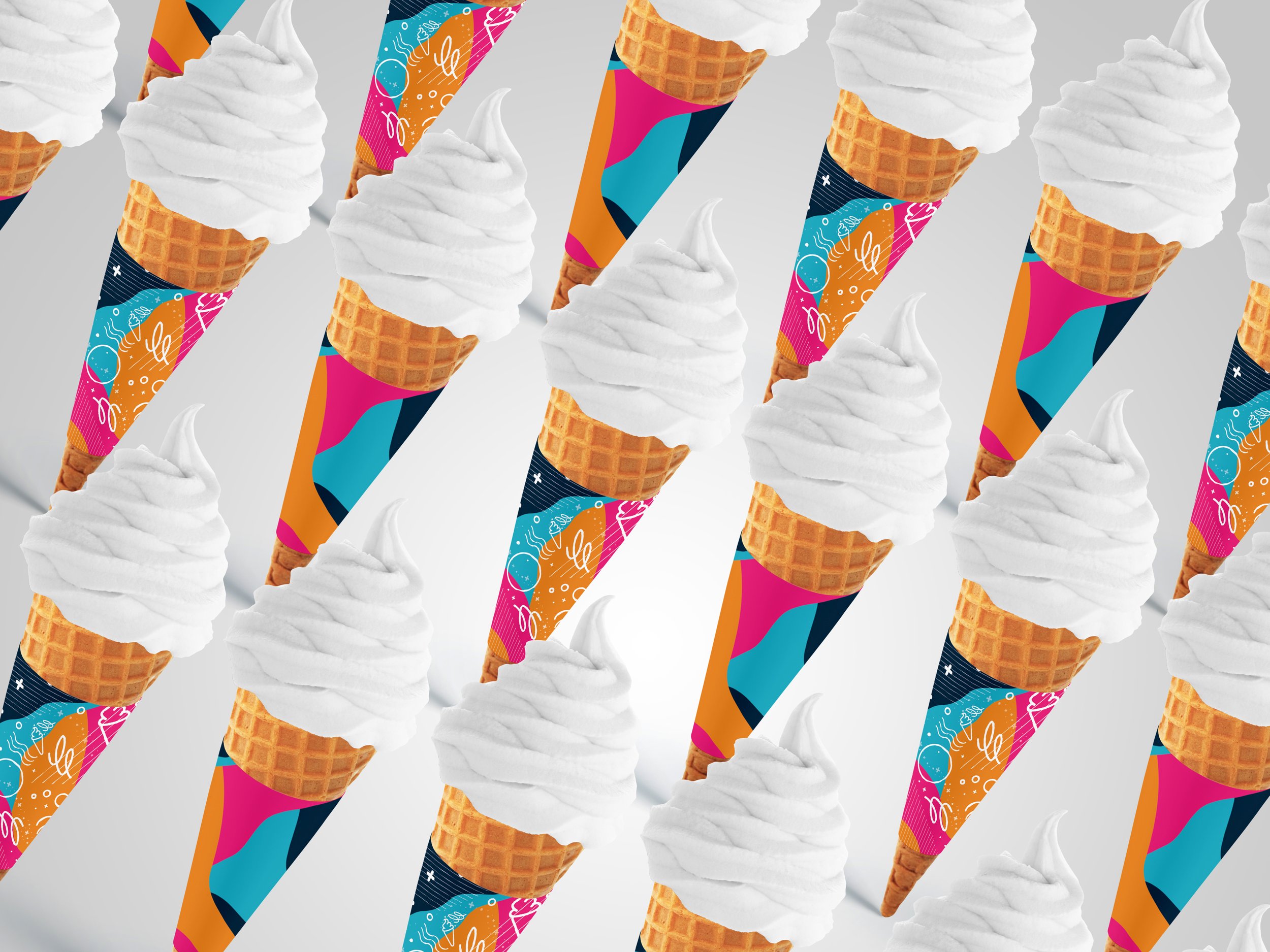
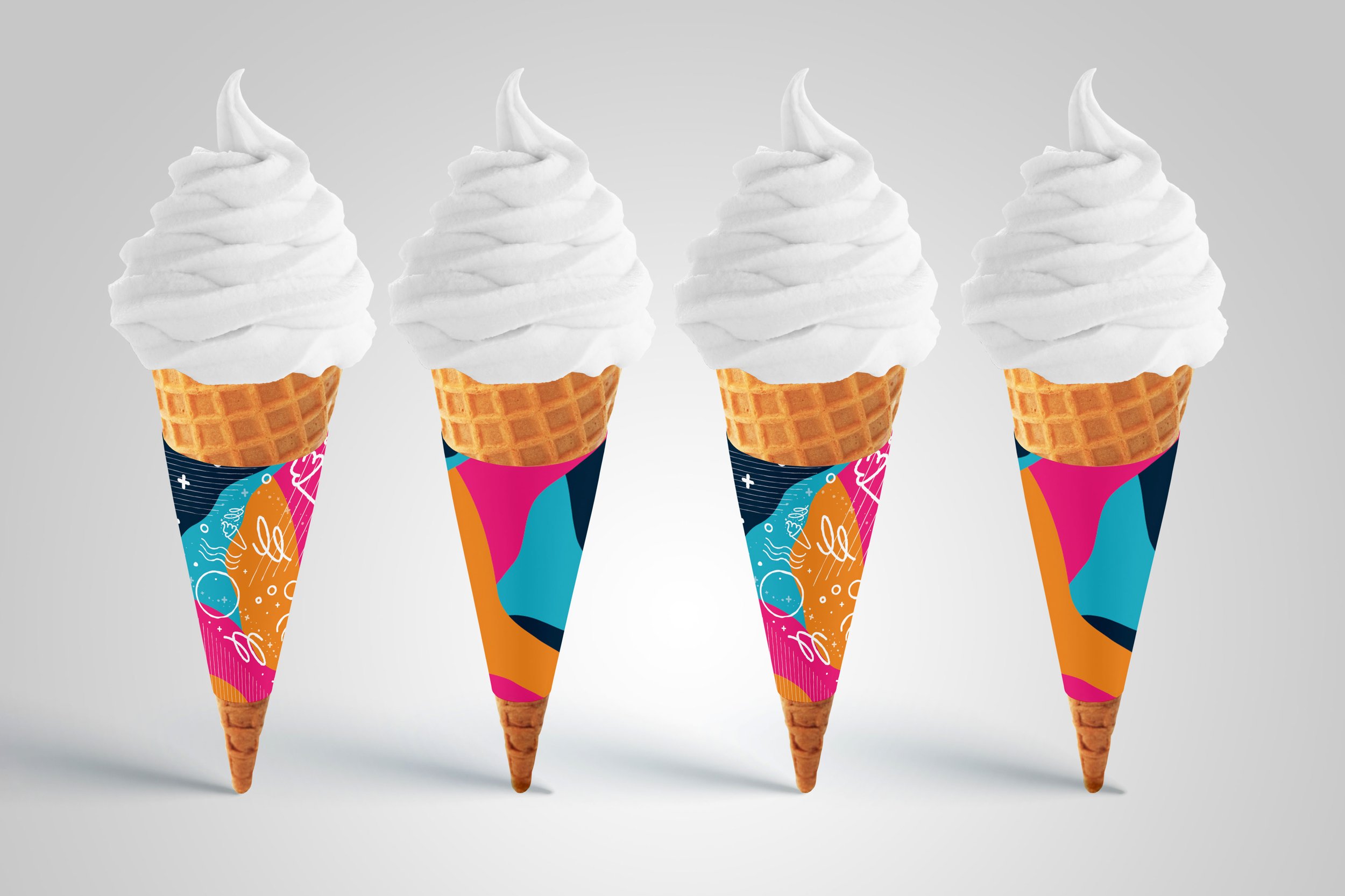
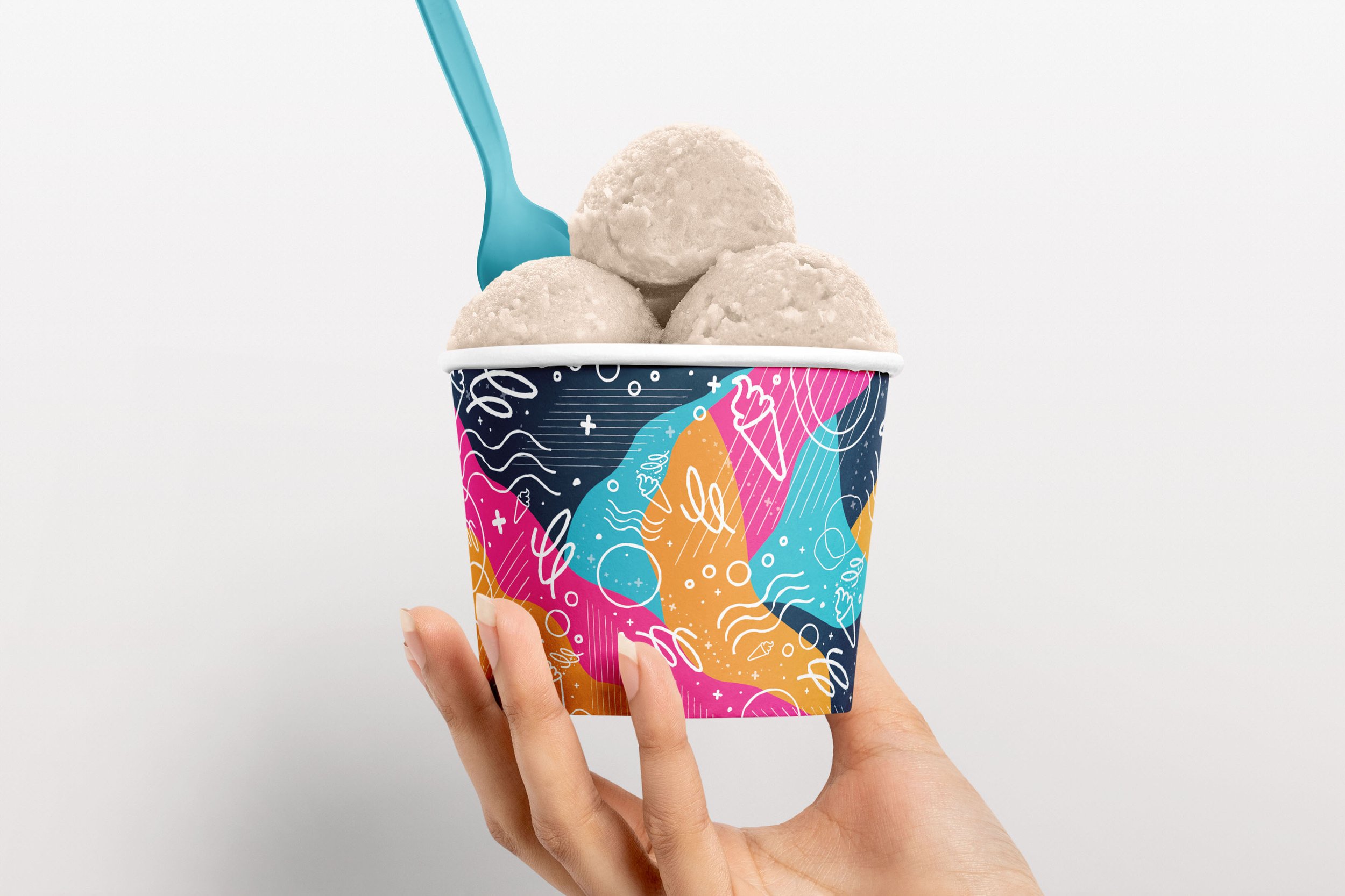
Illustrations & Pattern
The branding and illustrations accurately reflect the brand vision and personality - clever, fun, imaginative, friendly, quirky and playful. They also imply the creative and fun nature of the brand. The pattern is fun, quirky and dynamic. It also depicts the motif from the logo in its rocket form and ice cream form. The pattern appears outer space-like, yet still comes across with an ice cream vibe.
Process Work
-
![]()
Initial Logo Ideation
-
![]()
Logo Brainstorming
-
![]()
Logo Brainstorming Thumbnails
-
![]()
Logo Brainstorming
-
![]()
Packaging Brainstorming
-
![]()
Thumbnail Sketches
-
![]()
Colour Experimentation
-
![]()
Advertisement Thumbnails
-
![]()
Thumbnail Ideation
-
![]()
Packaging Thumbnails
-
![]()
Logo Linears


